simonw
5 days ago
There's some surprising stuff in this codebase. For example, https://github.com/xai-org/grok-build/blob/b189869b7755d2b48... is a "self-contained terminal renderer for Mermaid diagrams", which renders a subset of Mermaid chart types using Unicode box-drawing.
simonw
5 days ago
I had Fable 5 compile that Rust code to WebAssembly and build a browser-based playground for it, so you can try it out with Mermaid diagrams here: https://tools.simonwillison.net/grok-mermaid
A few more notes on my Grok code explorations on my blog: https://simonwillison.net/2026/Jul/15/grok-build/
thrdbndndn
5 days ago
I love this kind of stuff (ASCII art, if you will), but it just breaks down too easily as soon as Unicode characters (mainly CJK, as I'm Chinese) and fonts are involved.
For example, on your website, any chart or plot involving horizontal arrows breaks down because the assigned font-family (`ui-monospace, SFMono-Regular, Menlo, Consolas, monospace`, which ends up as Consolas on my machine) has no such glyph. Thus, it falls back to Segoe UI Symbol, which does not have the same fixed width (or is not fixed-width at all) as other characters: https://i.imgur.com/d2DPGHE.png

uhoh-itsmaciek
5 days ago
I ran into this problem recently on one of our blog posts: we used some Claude output which included tables drawn with Unicode line drawing characters. However, our monospace font did not include these characters, and so rendering fell back to another font in our font stack with different width metrics. I fixed it by using a font that had similar metrics and did include those characters with `unicode-range` (to only select characters we needed) and `size-adjust` (to match font width more exactly), and adding it to the stack. It's a little hacky but works pretty well in practice.
dolmen
5 days ago
Claude Code with Opus 4.8 is also bad at aligning boxes with content in French (with accentuated letters such as "é" which are multibyte in UTF-8).
dspillett
5 days ago
> Thus, it falls back to Segoe UI Symbol, which does not have the same fixed width
That seems like a glaring omission to me. If you are rendering fixed-width-per-character text and need to fall back, surely it makes sense to keep to the same character grid even if it does mess up the feel of your negative space somewhat (thin characters having a lot of space around them, wide characters butting into those beside them slightly). You've explicitly asked for text aligned to a grid, either by using a mono-spaced typeface, by using a <pre> tag, or with other relevant CSS choices, the browser should be trying to achieve that.
biztos
5 days ago
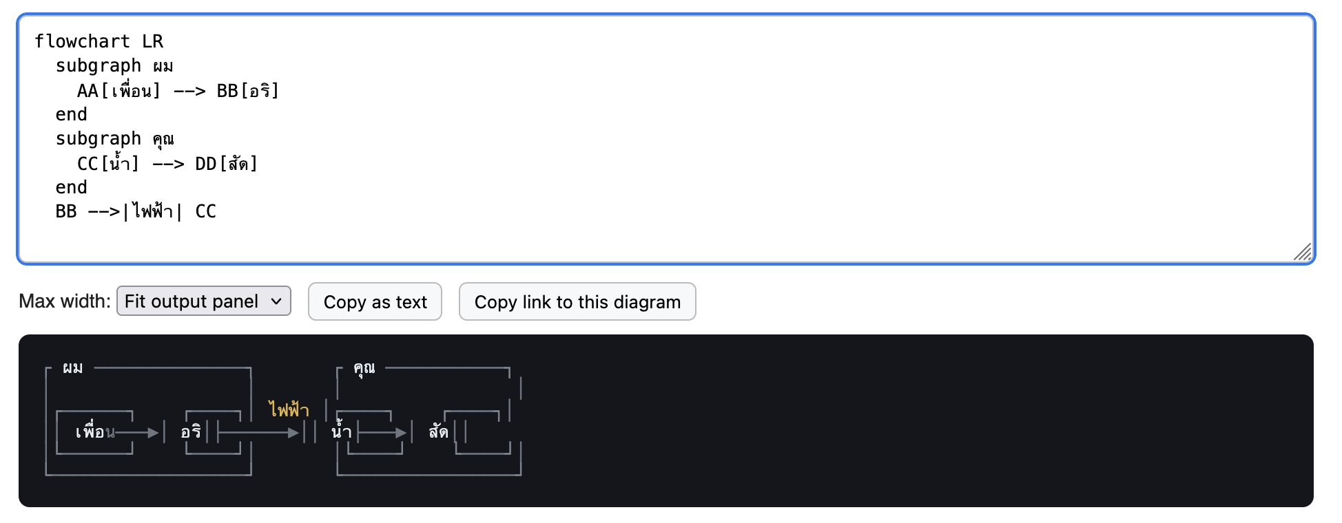
Interesting. Thai characters can also blow it out, I imagine because of the difficulty mapping glyphs to width:
https://biztos.com/hey/thai-mermaid-chart.png
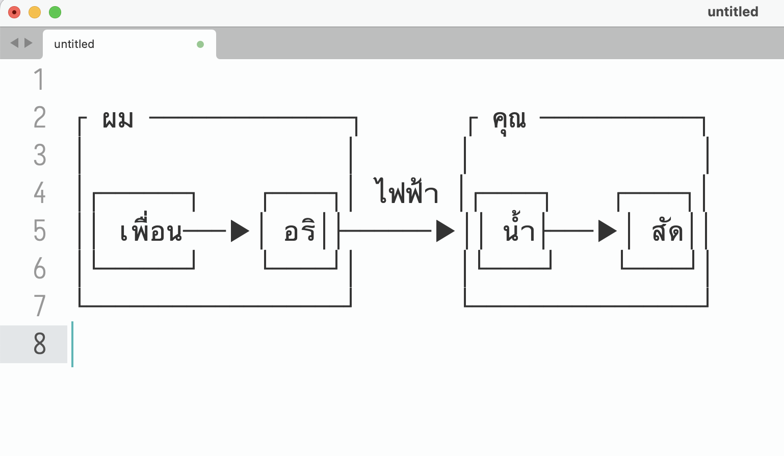
To my surprise, Sublime Text gets it almost right:
https://biztos.com/hey/sublime-thai-mermaid.png
I tried finding a Thai monospace font and using that in the HTML but it was worse, probably didn't have the box drawing chars.
Still a fun tool and useful for lots of ASCII cases!
sirn
5 days ago
The first issue is due to the assumption that character count equals character display width. Thai tone markers usually[1] should not contribute to the display width (เพื่อน is chars = 6, width = 4), so it caused a layout shift.
The second issue is due to the program's layout engine not adjusting the glyph width of a fallback font to that of the main font. A lot of terminals do this, but it's not common for text editors or browsers (arguably this is the correct behavior for non-terminals, since you cannot assume everything must be snapped to a grid).
Fun test for this:
     |กล้วยหอม|
     |Bananas|
[1]: some layout engines render free-standing tone markers as 1 character; in that case, this rule only applies to when tone markers are following a character.
oneeyedpigeon
5 days ago
That test looks pixel perfect in Chrome Android.
codethief
4 days ago
Same in Firefox for Android!
biztos
5 days ago
Thanks for the explanation.
Safari on iPad lines these up almost perfectly - the second line is a tiny bit wider, I didn’t even notice it at first.
That example had a tone mark but no vowels, so I will try one with both. E&OE.
    |ดื่มน้ำอยู่|
    |abcdef|
numpad0
5 days ago
This isn't a renderer bug, it's font. Proportional fonts aren't designed with alignment in mind at all, and you can't just expect monospace fonts for all languages outside of ASCII range to be present on random systems, or a single font or font family to support multiple different languages consistently.
You can't really control alignment of deeply Unicode characters like Thai or "→" against monospace characters without serving your own monospace fonts that are guaranteed to work for the characters you'll be sending out, assuming you can always have one in hand.
vidarh
5 days ago
You can still handle this well enough in the renderer, so I'd still consider this a renderer bug - e.g. my terminal emulator will scale any glyph that exceeds the bounding box as defined by the expected number of cells for a given character range. You can't expect any given feature of random characters to align, but I can expect box drawing characters surrounding any given characters to align correctly or consider it a bug (my terminal is almost certainly going to get CJK and Thai wrong - it's entirely untested -, but if so it is a bug, not a font issue).
That includes if I have to fall back, including fallback to proportional fonts, which will look ugly, but work and remain aligned.
numpad0
5 days ago
ok... I disagree, and I mean no offense, but there's going to be too much contexts and nuances to be taken into account that it's probably not worth trying for both of us. All I can say is that the problem is not that the pipe characters are given inconsistent width but that non-ASCII characters has all different random widths, and if you need texts with double-width characters like ▶, 漢, ก, etc., to align in a grid, you have to pick a fixed-width(not "monospace") font for the specific language and exclusively use that font for everything within that contiguous text area. Or you can try to fix Unicode so that symbols become variable width so to align to grid or something, but that's going to take a lot of effort.
vidarh
4 days ago
No, you don't need to pick a fixed width font for that. You will get the best results with one, but rescaling the glyphs works just fine. I've written a font renderer. It's not hard.
In fact my terminal, using said font renderer, rescales glyphs by default because even a lot of "fixed width" fonts are buggy and not truly fixed, and so enforcing the grid alignment and scaling to fit was the easiest way to ensure consistency.
Mixing and matching fonts for full coverage works fine, especially for wide characters.
numpad0
4 days ago
I thought this discussion is more about somehow aligning pipes over multiple lines in existing console emulators(impossible), than about implementing a complete custom graphical text rendering system specific to your app that butcher font files to put glyphs wherever you want?
That feels like cheating since you're not rendering provided font at that point. Besides you might as well just use SVG for diagrams than pretending to be text only.
vidarh
4 days ago
> I thought this discussion is more about somehow aligning pipes over multiple lines in existing console emulators(impossible)
I am aligning pipes over multiple lines in my existing console emulator. It's not just not impossible, but near trivial.
> than about implementing a complete custom graphical text rendering system specific to your app that butcher font files to put glyphs wherever you want?
It's not butchering anything. It is using the font data to render them in the way that fits the constraints of the output.
> That feels like cheating since you're not rendering provided font at that point.
Any font renderer makes just adjustments to make the font look as good as possible. That is the entire point of providing a scalable font instead of a bitmap font: That you can render the provided glyphs at any scale suitable.
Fitting the bounding box of the glyph to the bounding box of the cell the text is rendering into is entirely reasonable and the lesser of two evils when faced with a glyph that does not fit the cell, which is a relatively common occurrence, when the alternative is to clip.
It looks awful if you were to render e.g. latin script with a proportional font in a fixed grid, but for many scripts with more uniform widths the variation is a lot less, and so it's butchering things far less than rendering fallback glyphs for missing code points.
torginus
5 days ago
Considering the Chinese are one of the major contributors to AI, I would think this was a solved problem by now, at least in some other CLI based coding agent.
numpad0
5 days ago
Aren't those non-ASCII "rich" symbols from Japanese fonts around PC-98/Win95 domains anyway? For me with my background, it was always obvious that mixing full-width character in ASCII text never go well for various reasons. For ASCII arts, it is obvious that vertical lines never line up, and there are going to be tons of wasted spaces and different kinds of whitespaces needed to compensate for those. I wonder if specifying MS Gothic and retuning widths for it could help, at least for Windows/Linux.
jack1243star
5 days ago
Funny you'd mention MS Gothic (fixed-width), since old school Japanese ASCII-art on image boards assume MS PGothic (proportional!) instead. Some sites even try to detect ASCII art and force font-family on that specific post.
numpad0
5 days ago
Yup, 2ch.net/5ch.net/5ch.io uses the MS P Gothic and there were app features and fonts like Mona Font to emulate that. They were not imageboards, though.
I just thought that MS Gothic(non-P) should be kind of widely supported, have all the symbols you need, while also being a monospace, unlike most monospace fonts that only support ASCII symbols.
pmarreck
5 days ago
I was going to say, perhaps generate a failing test case, but testing for proper unicode rendering might be tricky??
Imustaskforhelp
5 days ago
Is there anything opposite of this perhaps as well?
I am interesting in having a perhaps standardized ascii art into mermaid diagrams (which I actually just recently found could be imported easily into Tldraw/excalidraw)
Do you have the source code of this available/open-source?, I would like to have a go at it in the opposite direction perhaps.
tulio_ribeiro
5 days ago
Thanks for doing the work and hosting this. This will very quickly become one of my daily drivers.
bearjaws
5 days ago
Thank you for creating an alternative to the toxic mermaid renderer on their website.
Trying to monetize Mermaid was disgusting and honestly rings to me like trying to monetize Markdown.
clkao
5 days ago
I had Fable 5 port this to golang[1], as I was looking for a way to render mermaid for my own markdown review tool[2]
skeptic_ai
5 days ago
How could be a fork outside of this repo? “ This commit does not belong to any branch on this repository, and may belong to a fork outside of the repository.”
sunaookami
4 days ago
Looks like there is a newer commit that was force-pushed and overwrote the linked one?
giancarlostoro
4 days ago
This has been my favorite coding harness of all time. The mouse works for a lot of things. Theres keybindings that confuse me, but I otherwise enjoyed it. I might wind up forking / contributing in the hopes of helping to make it somewhat better. I had built my own also using Rust but I liked their implementation much better. This might explain part of how they pulled it off.
OrangeMusic
4 days ago
I don't understand why these TUI are popular - isn't a regular Graphical UI better for this?
pilserlabs
4 days ago
Because GUI is resource intensive and they can run on headless computer/os like linux without Desktop environment , so Tui is perfect for mimicking GUI in terminal only computers