danpalmer
21 days ago
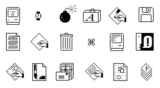
It looks like someone getting good at illustration. Older icons are far better illustrations. However icon design is not just about illustration, it's about clarity and affordances. Icons don't exist in isolation like an illustration, they exist alongside the rest of the UX and other app icons, and being recognisable is important.
All that to say, the sweet pot was likely somewhere in the middle of this timeline. The earliest icons aren't recognisable enough as they're too illustrative. The later icons aren't recognisable enough because they're too basic. The middle are pretty, clear from colour, clear from shape, well branded.
temporallobe
21 days ago
I spent half a year designing and creating 200+ icons for a custom geospatial mapping app. I really enjoyed the work but it was grueling and tedious, especially the design part. Too many people had too many different opinions on which symbols meant what, which styles clearly conveyed ideas without being too detailed, and many other things that kept wasting my time and causing a lot of rework and inconsistencies. It was literally just me doing the work, so I stopped trying to get consensus and took a few weeks to redesign the entire set and even used color science to inform my design decisions. I created the entire set without external input, then presented it. Sure there was some tweaking here and there, but I believe it turned about to be great and no one really complained in the end. The most important part was that end-users were happy. I used Inkscape and developed a set of scripts to automate the build and had everything in a very organized Git repo.
nine_k
21 days ago
> no one really complained
They were happy that someone finally made a decision, and freed them from the burden of fruitless repeated deliberation.
bigiain
21 days ago
Yep. Sometimes it's better to keep everybody away from the bikeshed until it's fully finished and painted.
heisenbit
21 days ago
Consistency sells but is really hard to ensure in time bounded series of narrow discussions with changing participants. But this must not discount the value of the preceding often frustrating search for understanding the requirements and prototyping. Throwing away the prototype while all the lessons are still in the head can yield great design.
ethbr1
21 days ago
In feedback solicitation situations with multiple stakeholders, it's important to attach cost to suggestions. Consulted without being responsible is always a dangerous offering.
Not in the sense of "This is how long that will take me" (because who cares about someone else's time?), but in "Of the 3 things you requested, which 1 is your must-have?"
Often this is approximated via design/dev team pushback, but it's easier just to be explicit about it: i.e. everyone gets X change request tokens.
pseudohadamard
20 days ago
This is why, when you've got a bunch of geeks deciding on where to go for dinner, someone has to say "We're going to the Jewel of India" and herd everyone out that way. If you don't do that then it'll be 11pm and people are still pulling up restaurant reviews and arguing over whether the one that got 4.3 stars really is better than the one that got 4.2 stars.
This is also the difference between a supremely dysfunctional and an OK-ish standards committee, the classic Home of Bikeshedding.
thechao
20 days ago
You can't say "no" to a restaurant without voting "yes" to an alternative. The first restaurant to a majority wins. Is it a perfect system? No. Do I get to eat in a reasonable amount of time: yes.
judahmeek
21 days ago
Resolving bikeshedding might be LLM's most valuable contribution to an organization
mschuster91
21 days ago
That's just like hiring McKinsey et al - the true value isn't the advice itself, it's probably been written down by some poor intern working 80 hours a week yet billed to the client as "director" time, the true value of why these consultants still get hired despite their truly abysmal track record is that management can use that "external advice" to cut through red tape and plow over internal resistance.
LLMs however... they give part of this power to lower levels as well. After all, what is an LLM other than the condensed knowledge of humanity? (Partially /s)
card_zero
21 days ago
Possibly the half year of annoyance helped inform the weeks of opinionated inspiration.
BTBurke
21 days ago
I’d be interested in seeing those if you’re open to sharing.
temporallobe
21 days ago
This was about 8 years ago and I am not sure I ever retained a local copy of the repo. If I find it, I’ll resurrect it in a public Github repo unless there’s some NDA/IP issue.
xattt
21 days ago
Queue adenoidal voice:
Apple has the benefit of massive cash-flow and, as a result, hiring many competent designers who draw and create to a specification. The specification could be created by another team of senior designers that are paid handsomely to deal with the gruelling task of defining a corporate identity.
This is similar to how major feature cartoons, which typically require variations of an image to be drawn over and over again, are typically animated by more than one person.
I.e. Apple has the money. They can do better than having one extremely hand-cramped illustrator crank out silhouette-style icons.
alfiedotwtf
21 days ago
> Apple has the money. they can do better
But they haven’t. The latest Mac OS is atrocious. Glass? Are they literally trying to mimic 2006’s Compiz?
xattt
19 days ago
I think there are designers that think they are hot shit that don’t know graphical history, and go by “feel” for their design.
spiderfarmer
21 days ago
This is one of the many reasons I do my own projects. I do value the opinion of people without knowledge and experience, but I don’t want to feel obligated to make them feel I did what they wanted.
chrisweekly
21 days ago
can you share the icons? curious to see the finished product
amelius
21 days ago
Question: what do you think is a great example of an icon for people/users? I'm asking because to my taste nobody seems to get it right.
temporallobe
21 days ago
I am partial to the relevant icons in FontAwesome and these days the Bootstrap icons. I think the silhouette of a generic, androgynous portrait universally gets the idea across nicely.
qznc
21 days ago
Do you think it would have worked out if you skipped the grueling and tedious discussions entirely?
temporallobe
21 days ago
I definitely needed the initial input from the stakeholders as to what they wanted and why, but it turned into pointless bickering about colors and many disagreements about symbol meanings - for example should a dropped pin have a shadow? Should it be pin or a baloon-like thingy? Should it lean left or right? How does one represent a “duty station” when there is no previous iconography or other kind of standard around this? It also led to a lot of design-by-committee meetings where well-intentioned people suggested good ideas but things were always left at some ambiguous action item that never had any follow through. This took months and I kept re-rendering the icon set (which were all multi-layer SVGs) and then pasting the PNG renderings into a Word doc because that’s how they wanted to review them.
What this did teach me was to create very efficient workflows. I had all the Inkscape keystrokes memorized and found out they had an API that allowed me to create some level of automation (things like batch conversations IIRC). I kept certain symbols as separate base/template images so I could quickly swap things in and out. I had separate color files with swatches of various color themes, all in hexadecimal. Since I was and am fundamentally a software engineer, I used those engineering processes and principles to make it more like a typical software project than just a collection of images.
HPsquared
21 days ago
Funnily enough that's (stereotypically at least) the Apple way of product design.
iamcalledrob
21 days ago
Designer here: there's a trade-off between visual harmony (all icons look the same) and ease of differentiation.
A standardized container adds regularity to irregular shapes.
Recently, Apple has been heavily opting for visual harmony, so their icons look consistent when seen as a set. Google too. It's an industry trend that is fairly annoying.
Similar "let's remove the differentiation" decision made for menu icons in macOS: https://tonsky.me/blog/tahoe-icons/
internet2000
21 days ago
Non-designer here: The bounding container being consistent signalizes "this is an App," which is helpful in the broader context of an operating system. For example, if I saw this on my file browser, I'd have to think if it's an App or a document: https://upload.wikimedia.org/wikipedia/commons/thumb/9/9e/Li...
That first level of signalization builds on top of familiarity with iOS. The squircle signifying app shows up a lot, even in marketing materials for iPhones and iPads.
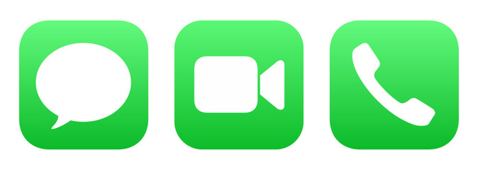
Once you're past that first level, you can use the shape inside the container. The Phone and Messages icons are just green squircles, right? Yet they're very distinctive, because the interior shape (phone handset, bubble) is what registers. https://t3.ftcdn.net/jpg/17/71/51/32/240_F_1771513287_ATNuUv...
iamcalledrob
21 days ago
It used to be the other way round. Sheet of paper indicates document/file, arbitrary shapes for applications.
I'd argue that differentiating apps from each other is more important than file types apart. Probably
internet2000
21 days ago
Mac OS and iOS thumbnails documents/files for icons on the file browser and search, so shapes are irregular. E.g. Landscape thumb for a .pptx, square album art for an .mp3, portrait for a .pdf, arbitrary shape for a .xlsx. 3rd party apps can participate in that through Quicklook plugins.
It's a great feature because I can scan several files named export (n).xlsx on my downloads folder stack, and know which one I want from the thumbnail alone. OS feature improvements change the design context.
everyone
21 days ago
But is it simply trading actual concrete functionality and usability in exchange for the concept of "superficially looks nicer to certain people in a marketing image" ?
iamcalledrob
21 days ago
I'd argue it's trading legibility for aesthetics.
My personal take is that aesthetics play an important function, but legibility is more important. Good design will achieve both.
reactordev
21 days ago
A great example of the pains it takes to achieve both:
https://admindagency.com/road-sign-design/
Road sign design had to achieve both and more and yet they still managed to pull it off.
rpdillon
21 days ago
Yep, quite literally form-over-function.
curt15
21 days ago
>A standardized container adds regularity to irregular shapes.
Does putting differently shaped icons in a standardized container make them harder to distinguish? When I look at an object its boundaries register first. If all icons are enclosed in the same square container, then they all look like squares at first glance.
iamcalledrob
21 days ago
Yes, it does for the reasons you outline
fvgvkujdfbllo
21 days ago
I prefer illustrations and old school icons. Every icon was unique and easily recognizable.
Now all icons look alike, and it takes longer to recognize.
danpalmer
21 days ago
I think this spectrum shows the issues with that though. Take the last one, the pen pot. You truly have to _learn_ what that means. Pen pots aren't a thing that most people are familiar with (I've never used one, I don't think my parents generation did mostly either), and there's little explanation of what it is.
Move up just one previous, and you've got a good looking illustration still, the pen and paper, but now a) everyone knows what a pen and paper look like, b) it literally says the name of the app, and c) the yellow colour scheme distinguishes it well when scanning many icons. It's clearly more accessible to new users, existing users, young and old users, and in terms of illustration quality, seems pretty subjective as to whether it's better or worse than the last one.
barrell
21 days ago
I’m not convinced the pen pot needs any more learning than anything else. Even the ones with the paper - is it a word processor, emailing tool, something about newsletters? Maybe a PDF or markup tool? Or a layout tool for print media? Or just a signature tool?
At some point, the user has to find out, in the same manner they find out about the pen pot.
I think users could easily associate the “pen and poison potion” with word processing for years until someone says “click on the pen and ink” and then they have a lightbulb moment.
I think we went from icons being “visually distinct” to “visually descriptive” to “visually uniform”. Personally I prefer the visually distinct. I’m not convinced we gained some massive leap forward in usability moving away from it; I know I struggle substantially more to find an app or tab that I’m looking for nowadays than when I first got a Mac.
JumpCrisscross
21 days ago
> Pen pots aren't a thing that most people are familiar with
Personally, no. Cognitively? We've been seeing quills and ink in children's stories for centuries. One doesn't have to have used a bubble level to get the analogy in the iOS Level app.
> pen and paper, but now a) everyone knows what a pen and paper look like
A quill and ink are conventionally portrayed in relation to writing. A pen and paper could refer to e.g. sketching.
I'm obviously nitpicking. But I reject the notion that we have to oversimplify to the degree you're suggesting.
> it literally says the name of the app
The OS does this almost everywhere apps exist. Putting the name in the logo is superfluous.
concinds
21 days ago
I think that is the flawed conscious reason for these icons getting excessively oversimplified and minimalistic. And why the Save floppies were replaced with inconsistent crap. And some higher-up at Apple's severe untreated OCD is the reason for the excessive uniformity (squircle jail, one saturated dominant color, the geometric "grid system" they keep bragging about at keynotes). Look at old Launchpad screenshots from OS X Lion and you'll see what drove that guy nuts and made him ruin every icon.
I showed this timeline to non-technical people around me and they prefer... the original pen pot.
mchaver
21 days ago
Having distinct icons is nice. People can learn. It's cool to have cultural relics live on in some way. My kids recognize the floppy disk as save, but they have probably never seen one in real life.
spacedcowboy
21 days ago
As someone who still misses the skeuomorphic design of things like "Books", the first icon is dramatically more expressive than any of the others.
These days I do a search for an app by learning its colour, and using that to narrow down the options. There's much less visual associativity of "this icon" === "this app". I really oughtn't have to execute a hash-table search just to find the damn app I want.
just6979
19 days ago
I don't think skeuomorphism applies to icons. The early pen-and-inkpot icon isn't trying to act/feel like a pen and inkpot. It's not like there is an inkpot in the program's UI and you have to move the cursor to it every once in a while to keep typing. It's just a very unique and recognizable symbol to indicate which program is which.
On the command line it would be "Pages", something fairly meaningful. The equivalent to the latest icon on the command line would be just calling it "P". And then everytime you want to launch it you must select which P program you want among all the others; equivalent to searching the launcher for which "black blob with a couple orange lines on it" you want.
I have a feeling the icons tried way too hard to trend toward "minimal", but minimal is not the same as bland generic blobs like the latest ones are (and not just Apple, generic icons claiming to be minimal are everywhere). The middle one seems to be the best of both: fairly minimal, still unique, still indicates "writing", as opposed to either end which both seem to be more about the pen itself and would be better suited to an icon for the Apple Pencil section of Settings.
All of the pen-only ones are terrible for something called Pages, the middle-to-older page-based ones actually fit the brief.
mchaver
21 days ago
I think images and representations of no longer used artifacts still live on in our cultural knowledge. They don't necessarily have to be a part of everyday lives. Think of children's stories and fairy tales. I don't see swords and shields in every day life very often but I can recognize them easily. I've never seen a komodo dragon in person but could recognize one if walked down my street.
fvgvkujdfbllo
20 days ago
My issue is not that if icon represents what the application does but they all look alike.
The old school icons, even if they were not good representation of what applications did, were distinguishable from a distant. Once you memorized the icon, you would easily find it, on your machine or someone else’s. Even on very crowded desktop, each icon stood out.
coldtea
21 days ago
>I think this spectrum shows the issues with that though. Take the last one, the pen pot. You truly have to _learn_ what that means.
Not an issue. You learn it once, and then you instantly recognize Pages every time, due to its distinctiveness from all other app icons (and the same holds for each of the others).
You will be looking to click the Pages app among other apps (in a launcher, Applictions/ folder view, alt-tab app row), etc, for many years. You'll only need to make the discovery/association once.
LtWorf
21 days ago
The new one is just some lines over a background, and you'll have to pick it in a sea of other icons that are similarly 2-3 lines over the same background.
heraldgeezer
20 days ago
>(I've never used one, I don't think my parents generation did mostly either)
USED one? No but you have seen it in movies, TV, described in books etc so you know what it is. You can know things without using them personally.
Then again the new Gen Z and A cant read analogue clocks so I have honestly given up on the world improving.
albedoa
20 days ago
I admire the confidence of everyone replying that you will ever consider that you are wrong <3
fsckboy
21 days ago
>a) everyone knows what a pen and paper look like, b) it literally says the name of the app
c) Pages plays for the Dodgers
aaahhh! i get it, it's a sports autographs app!
puzzlingcaptcha
21 days ago
I'm not a Mac user, but ever since Google changed their icons a couple years back I still struggle to tell apart Maps/Photos/Drive etc at a glance.
kyleee
21 days ago
I am basically icon blind thanks to a couple decades of icon churn
seviu
21 days ago
The fact that since Tahoe everything is a squircle kills me. I can’t visually find my apps anymore.
It takes me several seconds to find an existing opened app when I hit cmd tab, it has been months already, I use my Mac for work, I know this stuff.
It’s not just the new design but also something else, like if part of my Mac lost its soul.
ljm
21 days ago
Older versions of MacOS had an elegance to them. It’s lost some of that over the years.
The overall trend towards minimalism has ironed out much of what made it unique and it hasn’t always succeeded in improving UX. Even Liquid Glass and the ability to tint the icons (to make them even more indistinguishable) depends on the detail being kept to a minimum.
rpdillon
21 days ago
Yeah, what's amazing to me is that they play with the icon so much in an environment where they expect people to find the application by its icon. I always set up my machines so that I use a launcher that allows me to type the name of the program and then press Enter because I hate searching through grids of icons to find things, especially when the icons change over time. But when the company itself is expecting people to find things visually and then constantly changes the visual landscape, it just seems egregious.
WWLink
21 days ago
I agree with your conclusion that the sweet spot is in the middle, because I could easily explain to my mom "click the icon that has a pen and paper" and it would be very obvious. The current icon is completely ambiguous crap.
jan_Sate
21 days ago
Anyone else doesn't like modern minimalist icon design? It looks boring.
fvgvkujdfbllo
21 days ago
Boring and same. Harder to use. It is for people who organize their books by the color of covers.
rk06
21 days ago
icons should prioritize usability first,and design, intersting afterwards.
if your users need billboards, then your job is to make great bill boards
WWLink
21 days ago
The current icons really aren't that good. Looking at apple specifically: The facetime and messages icons are almost completely indistinguishable. Get angry and say I'm blind, but so is a lot of the userbase - like legitimately, legally blind people.
The camera icon on iOS is just a fucking camera lens with a grey background. No context.
The calculator one is actually pretty good.
The photos one is also bullshit lol.
what
21 days ago
FaceTime is a video camera, messages is a speech bubble. They look nothing alike except they share the same colors?
dijit
21 days ago
they share so much visual language that I always do a double-take when I am about to click on MacOS.
You’re right that in isolation they are visually distinguished, but our eyes don’t see colour uniformly, and these icons do not exist in isolation.
I guess frosted white on green is not a good combination for quickly discerning shape.
wtetzner
21 days ago
Sure, but it's not clear they're unrelated. Maybe interesting is necessary (but not sufficient) for usability?
Also, the newer icons don't really indicate a word processing application. If anything, they're look like they might be for a drawing program. So regardless of interesting/abstract/whatever, it seems like a poor icon choice.
just6979
19 days ago
Usable icons _are_ a bit interesting. A bunch of same shapes with same-ish colors on a grid is NOT prioritizing usablity. It's prioritizing minimalism. The middle icons in that list are interesting enough that your visual cortex can pattern-match to your previous experience selecting that app without much conscious effort. The oldest is a bit much but at least still recognizable (not necessarily "well known", that's different), but the new ones are worse: so boring and generic that it takes actual conscious effort to select them from a sea of sameness.
LtWorf
21 days ago
I still love the KDE Oxygen icon theme.
Gigachad
21 days ago
None of the Pages icons are recognisable because almost no one uses Pages. The word icon is just a blue W which is not any more illustrative than an orange pen.
WWLink
21 days ago
The office icons are rather subtle but do sorta illustrate what they do if you look carefully - the word icon is a list, the excel icon is a spreadsheet, and the powerpoint icon is a pie chart.
That you have to look closely is kinda crap lol. Whoever designed the icons was more obsessed with consistent branding instead of making icons that make sense.
Looking at the start menu, some MS icons are great. Paint, Notepad, Calculator are all fantastic.
immibis
21 days ago
Office doesn't exist any more. Product suite was renamed to Copilot 365.
sparqlittlestar
21 days ago
I dislike MS as much as the next guy, but it's the Office mobile app that was renamed to Copilot 365. They haven't yet thrown away the entire Office brand
immibis
21 days ago
The word Office no longer appears on office.com.
inejge
21 days ago
Just like Twitter is now X, full stop? With the difference that the "Office" brand is much older and has much more staying power. Besides, the desktop application suite is still named the same AFAIK.
danpalmer
21 days ago
Document, pen, orange, and name "Pages" is pretty excellent all round for recognisability in my opinion.
Over the years Word/Powerpoint/Excel have done similar things, they have their own colour, their own name/letter, and usually have had a descriptive graphic in the icon too, indicating a document, grid, or slide.
shagie
21 days ago
One of my favorite series is Nathan Lowell's Solar Clipper... in In Ashes Born, there's an bit about creating a logo for the company...
    He pointed to the far end of his studio. Two tiny patches of white—which were probably actually gray—lay in a single pool of light. One was a smudge of red and the other was a spiral of red. “Which one of those is your logo?” he asked.
    “Neither,” Pip said.
    “The smudge,” I said understanding where the kid was taking us.
    “Right,” he said. “The smudge.”
    “What?” Pip asked.
    The kid held up the paper from the workbench. “Look, this is nice and all, but it’s too fussy. If you look at anybody else’s logo, it’s not fussy. It’s iconic. A crown with wings. A C in a circle. That’s yours,” he said to Pip. “All of them are simple shapes combined to form an unmistakable pattern.”
The goal of an icon is to be able to identify it quickly without having to read the associated text.
The inkwell and the two with the paper are artistic - but they aren't things that stand out quickly when you're trying to find them in the launchpad or on the sidebar.
Pages is orange. Numbers is green. iTunes is red. Keynote is blue.
For Microsoft, Word is blue, Excel is green, and Powerpoint is orange (and Outlook has an envelope like shape). The letter reinforces the choice, but that's more of a hint and reinforcement.
The shape and color is the important thing for quickly finding what you're looking for.
raincole
21 days ago
> it's about clarity and affordances
The ink pot one tells me it's clearly an Apple's app. Though I might not know what it is, I know it's likely Apple's.[0]
The new ones can be a random app that shows up in AppStore when you search 'note taking' or 'todo list' or whatever.
I'm also strongly against the idea that an icon needs to directly tell you the functionality of the app. Photoshop's icon is literally 'PS.' Twitter is (was) a bird. No one thinks they lack clarity.
[0]: of course in this AI era if the retro detailed illustration comes back, everyone will just generate their icons in that style... it's a battle you can't win.
nedt
21 days ago
OS X had a lot of icons that were detailed illustrations but you‘d only see it when you zoom in. Yet they also worked as small icons. You can have both and Apple did. The textedit icon is a great example.
christophilus
21 days ago
I agree. The middle one seems to be the best combination of clarity and simplicity.
user
21 days ago
ben_w
21 days ago
The new one, orange pen on black background, to me looks like a blacksmith hammer or a welding torch.
I would not associate it with writing at all.
2, 3, and 4 (from the left) look like they're for a notes app rather than DTP.
5 and 6 tell me what the app is for.
7 looks like an art app, not writing. I favour skeumorphism, but to work that needs to use metaphors people are familiar with, and pots of ink are something I know only from art stores.
dd8601fn
21 days ago
I actually had to try to zoom in on the older, “ideal” example shown, just to see what it is.
Yes, my eyes aren’t great anymore. Yes, I’m on my phone looking at a social media post. But I feel like the speed and clarity of the newer ones was (accidentally) on display here.
arendtio
21 days ago
I think it depends on size. If the icon is very small, I like the simple ones. If the icon is large, I like the detailed ones. Optimally, you can have an icon with more detailed versions when displayed larger, but it remains the same icon.
flqn
21 days ago
Nitpick: icons are about signifiers, not affordances. A button affords being pressed, an icon on the button signifies what pressing it will do.
hshdhdhj4444
21 days ago
How in the world are the newer icons more clear?
They are hard to distinguish from each other, removing the main goal of an icon…to make it easy and quick to uniquely identify an app.
QuantumNomad_
21 days ago
I use macOS and have done so for several years. But I had to look up this app icon to know what app it was. It’s the Pages app, which I don’t use and don’t keep in my dock. Looking at only the leftmost icon, I was thinking it might be the Notes app or the Freeform app, both of which might conceivably also be represented by what to me looks like an Apple Pencil for iPad.
Looking at the reminder of the icons, I recognize that it’s not the Notes app because although I no longer use that one I have in the past so I remember that it has looked like a notepad with some lines and some yellow on it. But the leftmost one might as well have been a newer version of Notes than the one I last used.
trueismywork
21 days ago
Latest icons are also horrible. Magnifying glass for "open containing directory".
kcrwfrd_
21 days ago
Tbh I like the far left way more than the rest. It is simple, clear, and distinctive.
Dead middle is decent too.
wtetzner
21 days ago
Is it clear though? It looks like an icon for a drawing app, not a word processor.
simjnd
20 days ago
> The earliest icons aren't recognisable enough as they're too illustrative.
What? The fact that they have a unique silhouette alone make them so much more recognizable than all the other versions.
pembrook
21 days ago
Exactly.
Anyone who thinks an intricate illustration of a quill and ink communicates to the user "Hey this app is our Microsoft Word"...is not thinking about what function an icon is supposed to serve.
It's like comparing a road sign to an 18th century painting and saying "LOOK HOW FAR WE'VE FALLEN!"
These are not serious people.
ImprobableTruth
21 days ago
The quill and ink at least communicates that it's about writing. The new one is so abstract that when I first looked at it I had no idea what I was even looking at, it certainly doesn't communicate "this is like word" to me. Without comparison to the previous icon, how many people do you think would understand that the bottom line is intended to be a stroke drawn by the pen?
pembrook
21 days ago
I think you might be post-hoc rationalizing an emotional feeling, as clearly this meme is emotionally triggering to everyones nostalgia/pessimism nerve (hence why it went viral).
I'm 100% positive more people would guess the far left icon is a text editor compared to the far right icon. Not that I like the left icon aesthetically. Both are pretty weak icons.
Dylan16807
21 days ago
Leftmost is probably a pen, rightmost is definitely a pen and specifically a fountain pen. I've never seen these icons before, and I'm trying to be the fairest I can, and I think rightmost wins at evoking "text editor". But the one exactly in the center wins by a mile. Pen on lined paper, hard to do better.
spookie
21 days ago
Same thought. The one on the left just conveys "notes" to me. Middle actually seems to be about a more "well put together" document. A fountain pen by itself doesn't necessarily mean documents to me, but signing them.
As you, never seen these icons in my entire life.
pseudalopex
21 days ago
Pages is a word processor. Not a text editor.
The far left icon's color gradient and Apple Pencil shape made me think it was for drawing.
dpark
21 days ago
Neither extreme looks like a real word processor. The left looks like maybe an icon for notes. The right looks like it’s for a drawing program.
mlyle
21 days ago
It's a page layout / word processing program. I see the icon and I think "maybe text editor, maybe drawing program".
#4 or #5 are best at conveying what it is for and for being distinct from other icons.
fatherwavelet
21 days ago
I agree but I haven't used Apple or iphone since the Apple IIe as a kid.
I am sure people have all kinds of associations and emotional involvement with these icons.
With having no idea what these icons even do, to me it just looks like meaningless complexity.