Mikhail_Edoshin
2 months ago
Pictograms in the interface are not decoration. Their purpose is to convey information in limited space. (The information should be that could be conveyed this way.) Currently they are often used as decorations or these two uses are mixed up. This is a mistake.
(It is interesting and saddening to see how years of UI research just went down the drain after Apple "resurrection". In my impression Apple was the first that started to lose their carefully collected UI expertise and replace it something that was original for the time, but that was all. E.g. I remember the very first ads after Jobs' comeback. They still had the beige Macintoshes, but their ads changed. Instead of a typical computer ad that showed a computer with a turned on screen and some desktop picture Apple's ads pictured turned off computers photographed from unusual angles or in unusual positions, like keyboard standing on its side leaning on the box, mouse hanging on its wire and so on. It was different, indeed, it stood out. Thing is, to always strive for that is harmful. Especially for user interface, where the motto is: do not make it original, make it right.)
Mikhail_Edoshin
2 months ago
So the rule of thumb is that: if the pictogram is always same, then as in Shannon's model, it conveys no information, and thus is decorative. Discard it.
One of first programs that put pictograms in menus was Microsoft Word. But the way Word did it was entirely different from what we do now. Microsoft Word had toolbars and their buttons, of course, were mostly pictorial. Toolbars could be turned on and off and users could assemble their own toolbars. Microsoft Word's menus displayed pictograms only for the commands that could also be called with currently visible toolbars. Have a toolbar visible? Its pictograms will appear in the menu. Closed that toolbar? The pictograms disappeared. The pictogram did not merely decorate a command, but also provided a hint that the user could call the command with a toolbar. This is informational. This is the right use.
20k
2 months ago
Pictograms let you parse a lot of information at a glance, because you can pattern match a group of differing symbols much faster than you can a block of text which all looks uniform. It lets you skip reading all the text when you're familiar with a dialogue, and you can short circuit what you need to click on without having to read
That's the reason why pictographic additions are so useful. Its the reason why we distinguish different kinds of UI elements at all, because colour and graphics are incredibly powerful shortcuts for parsing information
ACCount37
2 months ago
This. If I'm out looking for a "Save" button, I'm going to pattern match "ancient disk icon" without even thinking about it.
It's also the reason why some menu entries get icons and others don't.
If the icon doesn't convey information by itself (like a "move to top" icon example), then it's there as a visual anchor - and you don't really need to have 4 of the same "delete" icon if a menu has 4 different "delete" options next to each other. Just one is enough of an anchor to draw your attention to the "delete group", and having just one keeps the visual noise low.
Likewise, you don't need visual anchors for every single option - just the commonly used ones, the ones you expect people to be looking for, and the ones that already have established pictography.
sundarurfriend
2 months ago
> "ancient disk icon"
Even though floppy disks were a bit before my time and I rarely ever used them, seeing them be called ancient disk makes me wanna find the nearest coffin and just go lie down. :D
user
2 months ago
icoder
2 months ago
What may be added is that some people have a hard time reading words by their 'total shape'. I can imagine that for them, the difference between pattern matching symbols and strings of letters is even more profound.
rayiner
2 months ago
> Pictograms let you parse a lot of information at a glance, because you can pattern match a group of differing symbols much faster than you can a block of text which all looks uniform
No you can’t.
Levitz
2 months ago
I'd disagree but either way throw another factor in: non-native speakers and cross-language usability.
If your software is in some language and you are looking at docs or a videotutorial or something in another language, it's often hard to translate specific terms, Icons don't change language. They also help if you have to do something in another machine that uses a different language for some reason.
ericzundel
2 months ago
I concur that the icons aren't just decoration. I have sat down many times in a foreign country at a computer with localized settings and felt quite helpless to do even trivial things.
woobar
2 months ago
Look at the traffic signs. You have very limited time to read the sign. That's the reason they have distinct patterns and rarely (except in USA) rely on blocks of text.
sevensor
2 months ago
So do I want the button with the three horizontal lines, three horizontal dots, three vertical dots, nine dots arranged in a grid, the point-down triangle, or the point-right chevron? Generally these convey no information and I have to try each one to find the option I want. If it exists.
rerdavies
2 months ago
hamburger icon: originally, in older Android UI guidelines, provides access to a list of items that can be used to navigate between parts of a large UI. But at this point, pretty much evolved to mean "click to access a menu" on UIs that don't have a menu bar.
Three vertical dots: "More stuff that doesn't fit on a toolbar because the display on your current device isn't wide enough".
Three horizontal dots: click this item to access a dialog.
Point-down triangle: Select an value from a list.
There may be slight variations depending on the UI guidelines for the platform you are using (or designing for).
All enormously useful icons that provide specific context and meaning. I can't say that I've ever seen a piece of serious software that abuses those conventions.
ragazzina
2 months ago
> if the pictogram is always same, then as in Shannon's model, it conveys no information, and thus is decorative. Discard it.
If the text on the button is always the same, then as in Shannon's model, it conveys no information, and thus is decorative. Discard it. Just use the position.
wartywhoa23
2 months ago
And if the position is always the same, it is decorative, and we'd pretty much rather discard it too and use time, which does not stay the same by definition, and make them stupids click anywhere spatially but on precise time: t % 2 == 0 => action 1, t % 3 == 0 => action 2 etc - but that would be too much of a disrespect towards users, however stupid - and we have no choice but randomize those iconless textless positions dynamically.
thiht
2 months ago
> thus is decorative. Discard it.
Or keep it since decoration makes interfaces feel more alive.
Not everything NEEDS to be useful
Mikhail_Edoshin
2 months ago
Classic Mac OS window headers had striped or dot patterns that were kind of similar to rugged parts of various physical tool handles. So they were both decorative in a way and informational: this is a part you can hold and drag around. A typical interface will have a lot of such parts that are both functional and decorative, so it will feel just right.
Purely decorative parts are also possible (and even desirable), but they should be personal. A set of colors chosen by the user, a background texture, a picture that the user keeps on the desktop and so on.
thiht
2 months ago
That’s a very subjective view of design, and I strongly disagree with it. I don’t want everything to be too uniform
bigstrat2003
2 months ago
Everything in a UI needs to not hinder usefulness. Adding more information signals (icons) which don't actually convey meaning is clutter that makes the UI harder to parse. That factor is far more important than whether it feels "alive".
AndrewOMartin
2 months ago
Redundancy isn't a dirty word in Information Theory.
incrudible
2 months ago
Menus should not feel alive. Because they are menus, at any given point they mostly contain things the user does not want to interact with right now. Menu icons that serve as visual anchors are good, they help the task of finding the desired action, as well as building a visual memory. Icons everywhere achieve the opposite, for the spurious benefit of visual consistency. Menu items are not consistent affordances, they perform very different actions that are at best related, but oftentimes they are there because they need to be somewhere.
Y_Y
2 months ago
You remind me of my favourite bit of Windows software ever[0]. It made the desktop feel really alive with things like can-can girls and humanoid fish flying around your "living wallpaper".
Then again it was named Monty Python's Complete Waste of Time, so maybe it's not such a good idea for the default environment of a general-purpose operating system.
[0] https://www.mobygames.com/game/1975/monty-pythons-complete-w...
BaudouinVH
2 months ago
I tend to follow the "no form without function" design philosophy. Your comment makes me rethink that. thanks
strogonoff
2 months ago
A decorative element can be fine in a design model, but 1) a good design tends to have no purely decorative elements, and 2) it becomes problematic when the decorative element looks like a meaningful element but does not actually carry meaning (or the intended meaning).
We all recognise an icon in a menu as a meaningful element. Treating it as a decorative element is wrong and adds mental overhead, as we tend to scan every one of those icons (putting it at the beginning of menu text, i.e., to the left for LTR languages, makes it worse). It is well-known we do tend to scan these icons because that is the reason icons work: repeated exposure creates intuition. If this intuition is not put to use, then all such icons are a waste of our attention.
For example, a bullet in a list: fine (differentiates where each list item starts), window shadow or the 3D effect on window close buttons: fine (meaningful in terms if differentiating areas in the GUI, not pretending to do more); whitespace to set apart one thing more from another thing than from the third thing: fine (if that reflects the relationship between those things).
This is all somewhat simplified.
nottorp
2 months ago
> Not everything NEEDS to be useful
... until the not-useful becomes distracting and/or causes information overload.
In the case of Apple, I've been a user of the Accessibility menu ever since they introduced the stupid parallax wiggling of the icons. Right now i use: reduce motion, bold text and reduce transparency. Because I want to see what I'm looking for when using the phone and not squint through pointless effects.
antran22
2 months ago
in that case, they should make it optional. What some might find as eye candy, other finds as nuisance (case in point, animation).
Perepiska
2 months ago
JetBrains products had colorful and useful pictograms on menu items and panels. One day they replaced them by B&W versions and it was fail. Few years later they introduced purple icons. For promoting some internal AI companion.
scoofy
2 months ago
The pictogram is there for people who can't read English, to help them get by.
It's the same reason why Ikea's instruction manuals typically have no words.
eviks
2 months ago
> Their purpose is to convey information in limited space.
No, that's only one of their purposes. Another one is faster visual parsing of shape recognition instead of reading even if space is not an issue (just like with all of these menus, they waste so much space on padding they could fit command names 3 more times)
Mikhail_Edoshin
2 months ago
Right; but this is also information. The Civilization game used little pictures of wheat and shields, I think, to indicate the production levels. Here the pictures are better than numbers because they feel more like actual things and allow to express all the details we need. We understand smaller numbers differently, three vs five is not just arithmetical for us, it is more substantial to actually see three vs five items than a different shape of a digit.
JeremyNT
2 months ago
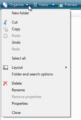
Yes, and as much as I hate to defend modern UI designers, I believe the icons in the menus here are actually extremely helpful (even when duplicated).
In the first example, when I want to find the option to add or delete a row in this massive menu, the icons clearly convey the purpose. I can instantly filter a huge list of possibilities down to a few relevant entries.
kldg
2 months ago
yes; I think it depends a lot on how accepted the icon is. Every few months when I have to open ST's CubeProgrammer, my brain substantially deteriorates because they don't use text and the icons for their main tabs are not always understandable to me. (and the thing's otherwise a relic from 20+ years ago)
X, volume & mute icon, disk icon, upload/download icon -- these are all fine and good; you don't need to spell those out for me because their use is so widespread that even if I didn't know what they meant, it'd be very useful to learn. I have no idea what a generic "integrated circuit" icon means, though, and I doubt anyone will use it elsewhere to mean the same thing, so I just click around randomly until I find what I'm looking for, like I'd do with the previously-unlabeled 6-switch panel in my living room where the positioning of the switches have no obvious relation to the physical placement of the ceiling lights.
I think Apple's menu actually shows exactly what I want and expect; show icons if it'll help me, don't show them if they wouldn't; though in come cases, I think Apple could apply some more icons (like for "Stop", there are a few good choices for that).
alansaber
2 months ago
Nothing more addictive than adding more padding
vasco
2 months ago
I disagree, pictures are easier to remember than words and I'm much faster (several hundred miliseconds) at quickly spotting an icon in the 12th place down a list and clicking it because I memorized it visually than reading the actual words.
So icons make power users faster. It's not "clutter". Your argument about "don't use it for aesthetics" is ironic because you're making it because of aesthetics. For me it's about user speed.
alternatex
2 months ago
>I'm much faster at quickly spotting an icon
Using the label-less example in the article with the 10x10 monochrome icons I doubt many other people feel the same.
stanac
2 months ago
> 10x10 monochrome icons
I don't mind the size, but lack of colors is annoying. If common icons where color-coded, like green to save, blue to download/print/export, red to delete, UI would be friendlier to use.
swiftcoder
2 months ago
> If common icons where color-coded... UI would be friendlier to use
As a colour-blind person, this sounds like accessibility hell. Don't forget your UIs still need to be friendly in what amounts to monochrome
oracle2025
2 months ago
I think it is important to stress that both, color _and_ shape should be visible distinctive, and as you say it is important that the color palette is chosen in a way that even if the color does not stand out for a the color-blind person, the contrast stays visible.
Making everything monochrome is surly not more accessible, because there sure are people who find it easier to distinguish by color than shape.
carlosjobim
2 months ago
Why in the world would colors discomfort you if you can't discern between them? Icons have until recently always been color coded. That doesn't make them a problem for the color-blind. You can look at the shape of the icons and read the text next to them. Would a pedestrian traffic light be better if it wasn't color coded? Would a white car be preferable to a red car?
swiftcoder
2 months ago
> Why in the world would colors discomfort you if you can't discern between them?
Because pretty much as soon as one starts colour coding items in the UI, people start using the specific colours to encode meaning. If your UI requires someone to discern between the red and green versions of the same icon in your UI twice, congrats, you just lost 8% of male users!
> Would a pedestrian traffic light be better if it wasn't color coded?
If they weren't colour-coded, they would have to be differentiated by shape, and then when I traveled to Canada, I wouldn't have to guess whether the fancy horizontal traffic lights are ordered left-to-right or right-to-left
> Would a white car be preferable to a red car?
Even fully colour-sighted folks can't see red very well at night, so yes, white car > red car
swiftcoder
2 months ago
Personal anecdote re the traffic lights: I thought "green light" was a metaphor until sometime my twenties, when a friend explained that the 3rd light actually is green to other people. It's always been a white light to me
carlosjobim
2 months ago
With that line of reasoning we arrive at the conclusion that all graphical elements of an interface should be removed, as the blind cannot see icons.
> If your UI requires someone to discern between the red and green versions of the same icon
Color coding has never been about this, only when implemented wrongly. It is just an extra differentiator for GUI elements which are already differentiated by icon shape and text labels.
swiftcoder
2 months ago
> Color coding... is just an extra differentiator for GUI elements which are already differentiated by icon shape and text labels.
In principle, I agree, but I do not believe I have ever used a software package that follows this philosophy. In practice, once you give people a tool, they are inclined to use it, and most projects only try and address accessibility concerns post-ship
kergonath
2 months ago
And also in some cultural contexts in which red and green do not carry the same meanings.
vasco
2 months ago
Monochrome is a strange complaint, the text is also monochrome. Regarding what most people think I don't know, I'm definitely faster at spotting a specific pictogram in the start of a line than having to read multiple lower information-density pictograms (alphabet characters) in order (reading a full word or sentence). This seems obvious to me, 1 thing is faster to parse than multiple things.
hypercube33
2 months ago
The monotone ones in Windows 11 that jump around in order or menu position (I think both of these have been addressed in 24h2 or something?) where they hop to the top or bottom of the menu or dont show so the order is wrong if they are disabled for some object are insanely bad UX.
I say this because I agree, the pictogram icon is much easier for me to find. I also like having a word there though, if they change the picture on me. If its not color, almost all bets are off, since I dont even look at the icon, just look for a color and go for it if thats available.
SmarsJerry
2 months ago
There was a point where a significant amount of menus in windows and office used only icons. It made it basically unusable for anyone over 60.
__del__
2 months ago
an icon for "save" will suffice to help me find the portion of the menu with "save as", "save a copy", and "export". when all four have the same icon, or slight variations, i'm back to reading each one to discern the difference.
Propelloni
2 months ago
Speak for yourself. I remember words. That disk icon stands for "Save". "Save" is what I remember. I also remember location, but the spatial component applies independent from icons or words.
vasco
2 months ago
> Speak for yourself
>> I'm much faster
Propelloni
2 months ago
You are right. My bad.
j45
2 months ago
Limited space seems like a surprising thing to lean on, especially when put next to a text label, with the increase pixel count/resolution on devices over the last 5-10-15 years.
Words create better beginners than icons alone.
UI/UX can evolve as the baseline digital literacy of users evolves usually very slowly, to remain maximally inclusive.
One thing that I'd consider is start with text labels, and the more they are used, start showing an icon. Just hold a left bar for them to start appearing so that learning can happen.
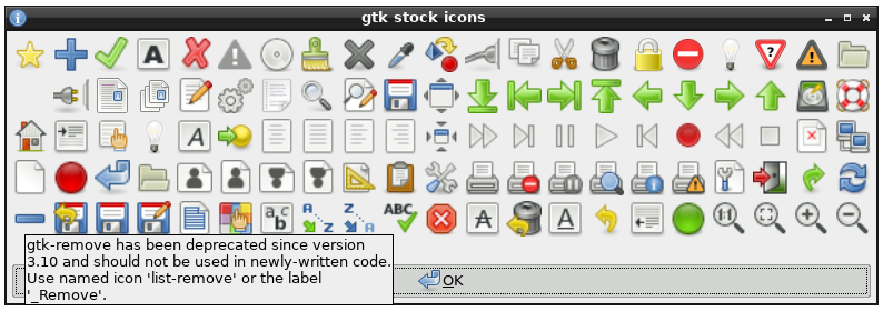
The screenshot where there was only some menu items with icons feels more memorable for that reason.
hypercube33
2 months ago
I hate the monotone ones - I get it, its easy to tick the box that they are colorblind safe or whatever, and its modern design, but man the colors really help me identify what the hell I'm going at in the menu. Brown thingy (clipboard) is copy, black square is save. I'm a simple creature.
mopsi
2 months ago
Same. Most people identify a blob of color far earlier than they distinguish one monochrome shape from another.
illiac786
2 months ago
> the motto is: do not make it original, make it right.)
Agreed. It just doesn’t sell.
#/media/File:Minims_(palaeography).jpg)