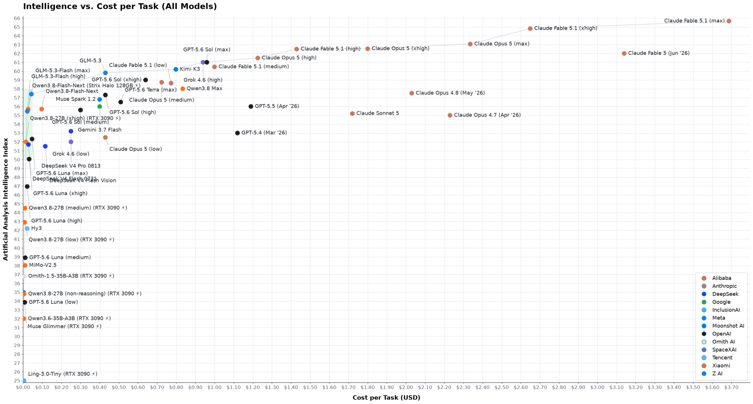
There is an immense difference in cost between the state-of-the-art models from Anthropic and OpenAI and the much cheaper Chinese models ... How much extra intelligence emptying the wallet purchases obeys the law of diminishing returns: while a top-tier engineer or scientist is probably going to be able to appreciate how much better Fable 5.1 [is] ... most people will have a hard time doing so.
Nebari is officially listed as a JATIC product as part of the next-gen toolchain supporting DoD AI development.
Are we officially ~one degree of Kevin Bacon from the DoD endorsing running Chinese OSS models because they're self-hosted and we're all too dumb to tell the difference?
https://openteams.com/open-source-isnt-the-real-risk-in-nati...
This looks great! I also think speed should be part of the metric (i.e. how long does the model take to actually solve a task). For me, I prefer to run expensive models such as Sol on light reasoning, which usually gives me good answers with quick responses.
For my style of coding (quick back-and-forths and corrections) it makes a big difference if a model comes back in 1-2 minutes compared to 5-10, and I am happy to pay a bit extra for that.
I agree on both: indeed a nice article, and I'd like to see a chart with speed as x axis.
As someone who only needs AI for a couple of tasks per day, I don't really care how much it costs, especially when subscriptions are subsidized. I want to filter by speed (eg, max task time < 1 min) and then choose the intelligence I need for the task. This will surface models like Gemma4 31B (xhigh) running on Cerebras and GPT Sol (med) fast mode. Using these models feels great and are affordable for infrequent tasks.
Complaining about "bad charting" and posting a chart with y-axis that doesn't start at 0 is kinda weird.
to be fair, you don't need to start the y-axis at zero [0] but for some of the graphs where the lowest value is close to 0 the best practice is to do so
there's a fun Excel artifact where it auto-selects the 'relevant' range with no adjustment for how proportionally close to 0 the values are - a professional researcher publishing to a journal should know better (and should be ridiculed for not incorporating best practices) but for a personal blog by an SWE this really isn't the worst sin
[0] https://digitalblog.ons.gov.uk/2016/06/27/does-the-axis-have...
IMO in this case is mandatory to start from 0 because it alters the visual perception.
Just look at the first chart: the distance between Fable 5.1 and Sol is <5%, but it looks like 25 or 30%.
Yeah, this doesn't include older models, some of which were already saturating many common tasks a year ago. I'll often add them to the AA graph for reference.
Why use electricity alone for open models? Surely you’d want to spread the cost of hardware over the period too?
I think the key there is “hardware you already own.”
If you own a graphics card you bought for gaming or a laptop you bought for doing schoolwork there is $0 in cost of local AI tokens, because 100% of the cost was assigned to doing other things.
> Why AA’s plot is misleading
> The first issue I have with it is that it uses a logarithmic scale on the cost axis. Using a log scale is the only way to make you spot the difference between a model that costs $0.015 per task and one that costs $0.032, while the same plot contains a model that costs $3.69 — almost 250 times as expensive. However, the net result is that the viewers can no longer appreciate the immensity of the price difference between the cheap models and the heavy ones; nor can they realize how inconsequential the price differences are between the cheap models.
This is an asinine complaint, and nobody can seriously tell me that the last plot on their page [0] is more readable than the AA one [1]. If I'm using a model at the lower range of the cost scale for whatever list of tasks, and i switch to another model at the lower end of the cost scale, my spending might double anyways! This should be reflected in the plot, and linear scale doesn't do it justice.
It's also much easier to see the mentioned pareto frontier in the log plot than in the linear one.
I can see why they disagree with the pricing determination for open/local models, but I don't think there is one clear right way to do it. So how do they do it instead?
>Hardware is priced at zero, on the basis that both an RTX 3090 PC and a 64GB Strix Halo are desirable gaming/work machines anyways.
...oh
Would have been nice to mention explicitly how the pareto frontier changes with those new calculations.
[0] https://openteams.com/wp-content/uploads/2026/09/all_models-...
[1] https://artificialanalysis.ai/#intelligence-comparison-tabs
It’s funny they state log plot is “the only way” to keep the cheap area readable, say they hate it, and then immediately have to zoom into their non-log plot cheap area because it’s unreadable.
When I accessed the site, it showed the FBI badge says that the site was blocked and redirect to fbi.gov !! WTH?
Not seeing that, that's weird... Maybe a site sharing the same IP is blocked by the FBI through your ISP?
Open Teams originally wanted to rent out open source developers to sponsors with Oliphant controlling everything. Now they pivoted to installing local LLMs (on what hardware exactly?).
What will happen is that this will be the third consultancy with a lofty narrative after Enthought and Anaconda that Oliphant established. It is always bait-and-switch.
to choose a model, you have to consider intelligence, price, and tokens per second. would be nice to see the 3 dimensional plot.
Is there a case in which a heavy agentic coding user of mid or mid++ tier (remotely hosted) models is better off using PAYG/API pricing than just getting a subscription? (Assuming no easy access to high end local hardware and I've deliberately left the top tier/cutting edge models out becau).
Well done. The inability to switch between log and linear always bothered me.
Another thing is if you're using the subscriptions with OpenAI or Anthropic you get an order of magnitude discount relative to the per-token price. So you need to move their models ~10x to the left on the plots to get a fair comparison.