jjcm
10 hours ago
> There are other aesthetics my brain associates with AI, like beige/cream colors, orange accents, and serif typefaces
Something to consider regarding the narrow space AI-created designs align on: LLMs are trained to write consistent code. This makes sense for something like a billing or a backend function - you want that code to be consistent. The problem though is that LLMs write code to represent designs as well, which means you get consistent designs. You end up aligning on a generic mean because of it, which is often why you see these repeated aesthetics.
It was something I saw when I was working on AI tooling over at Figma. It was very hard to get creative, unique outputs out of LLMs.
One thing I'd recommend if you're trying to avoid this is try a diffusion model as a starting point. Gpt-image-2 is a VERY capable designer, and Opus and Fable are fantastic at converting images to webpages. Starting with images will let you sidestep a lot of the uniformity of output that LLMs have. I'm heavily biased here as this is what I left figma to build (https://news.ycombinator.com/item?id=48995754), but even starting with gpt-image-2 to give you a general sense of the look/feel will heavily differentiate you on the design front.
Here are some examples of image->webpage outputs I've been playing with:
websight
9 hours ago
I don't think these look "bad" exactly, but they do look like AI, and I don't think that's just because I know they are.
Retr0id
9 hours ago
I don't think I'd clock the ramen one as AI, if not for the main image being AI generated.
somenameforme
7 hours ago
The one thing that strikes me as LLMesque is the occasional use of random and seemingly inappropriate symbols. For instance the lightning bolt and then the arrow/square by the order ahead label by the start an order button. It's also placed in a slightly odd location. The symbols at the top are also kind of weird. I think it's the LLM trying to allude to the cyberpunk theme, but it does a poor job of it in a way that even a low skill human probably wouldn't - because you just wouldn't think to put a part of a rectangle up there beside a checkerboard pyramid thing.
And that contrasts to an extreme degree against the rest of the scene which flows extremely well, maintains perfectly color coordination, and so on. I think it's kind of like how self driving cars can drive phenomenally well but then have occasional failure modes like randomly driving head first into a concrete divider. It's not like that's bad driving in the sense of missing a nuance, but something that's just completely conspicuously outside the rest of its demonstrated abilities.
majormajor
7 hours ago
Yeah polish + consistency but also with busy-ness is a hallmark from what I've seen. It can be tamed, but takes effort.
That said, the provided examples definitely are a clear step up from the "default" you'd get. Like how some bootstrap-templated sites did it much better than others, while the best made it nearly invisible.
weiliddat
3 hours ago
What you said made me think that it's similar (not entirely the same, but adjacent) to those make-a-website for $XX or buy-a-template era of websites.
If we think about that as the intended competition (and not websites corps spent millions on design/polish/copy), I'd argue that AI (model + coding agent + skills + whatever) is doing a better job overall. Most agencies don't spend enough effort in understanding what you want, or hire juniors and bill them as seniors. It's almost always late, overbilled, somewhat what you said you wanted but not really, and technically terrible.
lynndotpy
7 hours ago
I'd clock this as an AI website with no question whatsoever. Everything comes in punchy threes. I don't need to know what "早い・旨い・熱い" means in order to smell it for what it is.
gentoo
8 hours ago
They both read as hyper-polished pastiches of existing, well-established aesthetics. The cyberpunk one in particular employs just about every genre trope I can think of. There's no sense of stylistic ingenuity or choice - e.g. deliberately breaking from convention or leaving things out.
danans
5 hours ago
> There's no sense of stylistic ingenuity or choice - e.g. deliberately breaking from convention or leaving things out.
Is stylistic ingenuity, breaking from convention, or leaving things out on a website for a Ramen restaurant chain a feature or a bug? I'd choose to go based on the quality of the food not how unusual the website UI is. The website is not the product.
I personally find navigating and ordering food on restaurant websites that don't use standard conventions a frustrating experience.
kombookcha
5 hours ago
The website is not the product, but it does suggest something about the way your restaurant operates and how it is trying to present itself. You don't know the quality of the food before you go.
This summer I've noticed a lot of menus with AI generated images of food and I have not trusted a single one of them. If you are gonna pitch me with this thing that blatantly is not even tangentially related to your actual product, that does not give me a lot of confidence in your business. If they'd used a stock image of a carbonara I would be none the wiser, but the entirely fake stuff is a massive turnoff.
Some of the best restaurants I know have old timey bare bones websites because they've been around for decades, and it's an oddly good predictor of a place that has a lot of loyal customers.
If I saw a website that looked like the ones above, I would be immediately skeptical. Handmade but rudimentary says down-to-business no nonsense, shiny and nicely made by a pro says high effort. This stuff? It says slop shop.
mock-possum
4 hours ago
The design, no. The content? “Cyberpunk ramen, street side. Bold flavors. Fast pickup.” Oh my god yes.
The thing that really gets me about this stuff is - is all about the content, the actual content is what really matters, you need to have content that actually works, that people find appealing, otherwise you have dogshit. A staccato bullet point of marketing speak is dog shit. It’s nothing, it’s less than nothing, customers are repulsed by it, and rightly so. bad presentation you can sometimes get away with, but bad content? Almost never. And this is bad (LLM generated) content, at a glance.
ben_w
2 hours ago
> The problem though is that LLMs write code to represent designs as well, which means you get consistent designs. You end up aligning on a generic mean because of it, which is often why you see these repeated aesthetics.
I think this is more due to temperature (while the LLM is producing a design) rather than consistency. Consistency means it'll be yes-and-ing all the way once it starts, but that initial seed? You meet one instance of Claude 5, you've met them all. Ditto ChatGPT-x or Gemini-y.
Because each blank context window starts the same, the only initial seed of variation is the user prompt. If the users don't mention style, then 5000 people all prompting for "single page web app to do X" will get very close to the same result.
Most humans keep asking for the same, and the output is therefore analogous to Simon Willison's pelican on a bike, where the output is overwhelmingly facing to our right, and to the extent that the bike is functional and would actually e.g. steer, it's a standard bike rather than recumbent, cargo, or tandem.
floam
9 hours ago
I tried your tool just now, on my iPhone. I am really kind of stuck and frustrated. I cannot get that first box, the one you can type into, that’s on a grid into a state where I can interact with it.
Stuff is jumping around after I try to move the canvas around, unexpected stuff. I can’t figure it out.
jjcm
8 hours ago
Oof, apologies. I have not done any work at all on mobile to make this work.
chadash
10 hours ago
I like your product and I’m gonna try it because I’m growing to hate the “Claude generated website aesthetic” but $0.13 is way too cheap.
jjcm
10 hours ago
Ha! Totally fair. 13 cents is 0% margin, which is what I'm targeting for individual plans.
I literally just got my SOC2 compliance complete an hour ago, and I'm gonna roll out team plans/enterprise plans next week (unified billing + shared brands). For teams I'm gonna charge a flat 25% margin on API costs, and for enterprise I'll have a 50% margin + minimum spend.
I think I'm going to keep the individual plans at 0% though. Realistically until my own diffusion models I'm training are the main model I'm using for generation, I'm just an API wrapper + harness. At the individual level I want to be competitive with going directly to the api and coding your own harness.
I am curious though - what would you pay per image?
chadash
8 hours ago
Ok, so I signed in to your site and started out. The $0.13 is a bit misleading because by default it generates 4 images per “sketch” so it’s more like $0.50. So I can easily get to $5 in a session, which feels like a good amount. That’s about the amount I would pay to just play around and I like that you start me off with a few credits
If I’m using this towards something that makes me money, I’d pay a lot more, but it really depends on context. In general, I’ll spend $5 like it’s nothing, $20 if it’s nothing and it’s for a business expense, and probably $50-100 for a design scheme for my (quite small) business. I don’t know that I’m a representative sample, but I’ll put my money where my mouth is, because I just added an extra $5 to play around more.
Btw, it’s a really innovative interface. It’s fun and very different from other tools I’ve seen. I quite like it but it’s also a bit confusing. Feel free to contact me if you want customer feedback (info in profile).
Barbing
5 hours ago
The cost-plus pricing strategy! Besides Cuban's Cost Plus Drugs, haven't encountered it much at all. Hope you start a trend.
https://en.wikipedia.org/wiki/Cost-plus_pricing / https://www.costplusdrugs.com
altmanaltman
7 hours ago
It literally is not though, it takes $0.50 for generating 4 images. That's on par for any image model by frontier labs. Probably just covering their costs right now but will keep rising it over time if the tool gets adopted. But it is not too cheap when you consider the sheer amount of variations one will make if they use this in a professional design capacity. The quality of the tool is not what this comment speaks on since i have not tried it yet but it is not "way too cheap" in any real sense given the pricing.
chadash
7 hours ago
I think that's fair, but if you add a lot of value on top, a higher price is justified. Would I pay $5 for a great looking homepage, even if I only have to generate 12 images at $0.13 ($1.56 total) to get there? Yes.
Sometimes models are vastly underpriced. Fable is an example. I can easily spend hundreds of dollars using it to code. On the other hand, if I'm looking for AI to review a contract for any obvious mistakes, I don't really care if I spend $0.01 vs $1.00, even if the difference is only marginal. I'll pay quite a bit more for something that's just a little bit better.
Same thing with design, in many cases. When the absolute dollar amounts are small, I'm happy to pay more for even marginally better quality.
altmanaltman
7 hours ago
I understand but you are thinking design and coding maps neatly one to one when it absolutely doesn't. If you don't care if the cost goes up 100x, of course it is too cheap for you. But that is not how everyone looks at costs even for marginal things esp at scale.
motoroco
9 hours ago
I wanted to try out your service but I don't have any accounts with Google or Microsoft properties (incl Github), so I can't sign up
keithnz
9 hours ago
maybe, but you can do wacky things, eg I put together https://scores.lazer-kiwi.workers.dev/ It's a dota2 guild (#1 guild in autralasia) website and I have a bot that extracts the scores and publishes peoples progress on the website with a relatively basic table and stats, as a random side quest all kinds of weird stuff got built in ( you can shoot all kinds of things, if you hover over the number in the # column of the members and it turns into a gold sights, then you can click that and there are all kinds of weird cinematics. Lots of semi crude humor and Kiwi / Aussie rivalry Jokes and internal digs at some of the players. The art is...errr... basic. There's a secret counter down the bottom left so you can tell if you have seen all the weird things or not. Note, on mobile it doesn't include the extras.
jjcm
8 hours ago
You have my dota 2 aus guild beat by a couple of places: https://image.non.io/dad602c8-4774-47dc-b671-c515c67a0cf1.we...
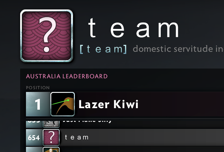
You definitely can do fun/creative things with LLMs, but they need a lot more steering/handholding. IE if you add an additional page to the lazer kiwi leaderboard, it's likely the first pass will be somewhat more generic than the homepage.
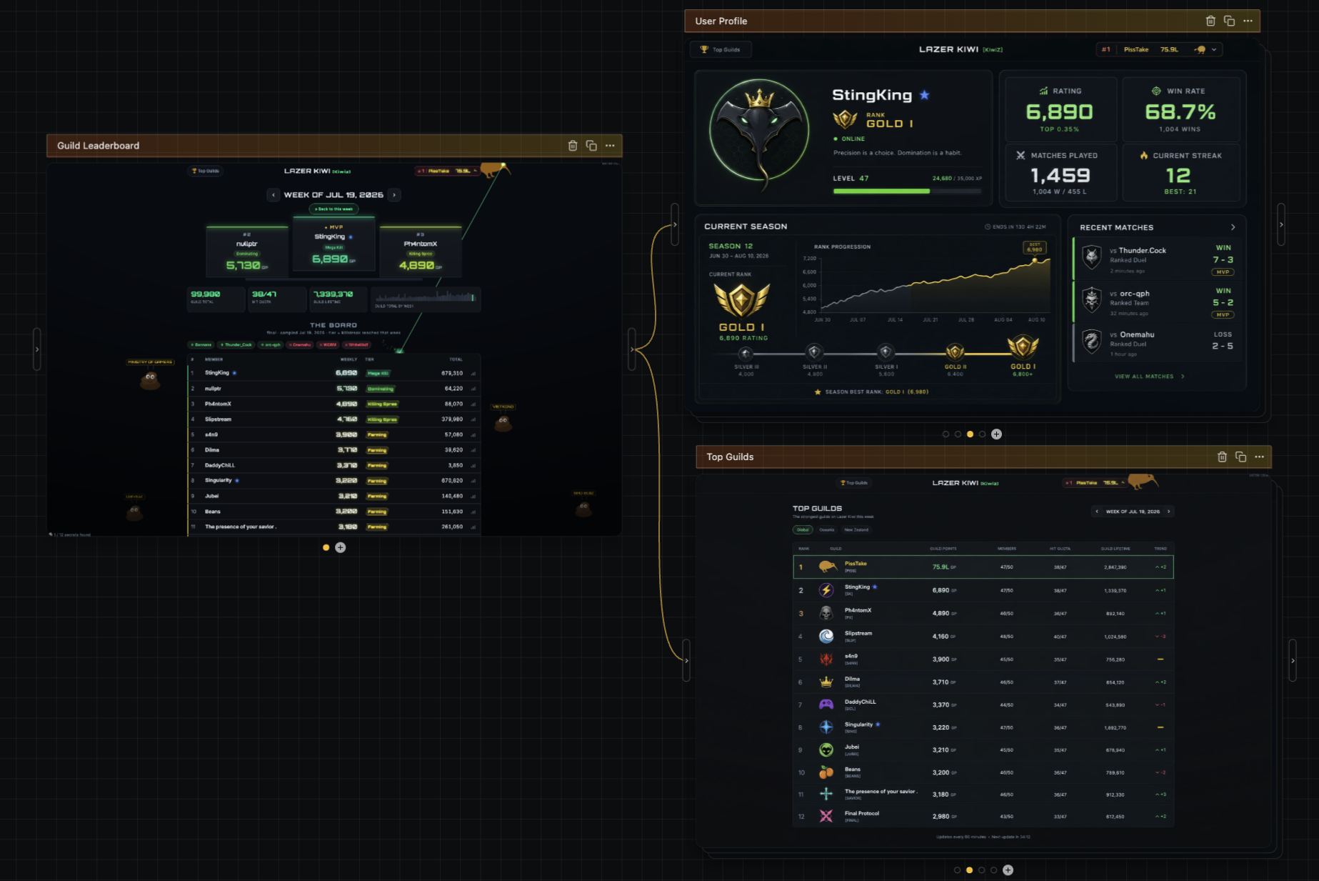
One of the other advantages of diffusion is that it does really, really well with style transfer, meaning designing additional pages in the same style ends up pretty easy. As an example, here are designs of a user profile page and a top guilds page, using the look/feel of a screenshot of your homepage: https://image.non.io/5415e0e0-9264-4bad-988e-8d9d3885b518.we...
the_sleaze_
7 hours ago
Laser kiwi reminds me so much of the old web circa 2008. Awesome.
huey77
7 hours ago
Lazer kiwi respect!
XCSme
5 hours ago
Wasn't one of the main original points of LLMs to be creative? To create stories, creative writing?
yorwba
4 hours ago
It wasn't the point, but early LLMs would make mistakes so often that writing fiction full of hilarious nonsense was one of the only applications. Now that they make mistakes less often, you need some other source of high-entropy randomness to reinject creativity into the story.
KronisLV
3 hours ago
> LLMs are trained to write consistent code
You are absolutely right, that's the load bearing assumption and it earns its keep.
Personally, I didn't mind when a lot of sites looked like the default Bootstrap theme (because that's what they used), because generally it made sense. I think that LLMs, both in regards to prose and the code and UIs they produce, could have lead to an age of decent - where things would be just fine and sane, the writing decent and not frustrating, the code easy to read and debug, UI whitespace and layouts would be good, fonts would be readable, usability would be great.
Instead we got AI slop writing that reads like someone turned the pop-sci/LinkedIn tone dial up to 11 and UIs that all feel like some sort of SaaS landing page.
Oh well, it could have been worse.
flemhans
2 hours ago
Haha, spot on, but I'm still wondering how specifically "earns it keep" became such a thing. I think it's a Claude specific phenomenon for me.
sebmellen
10 hours ago
How do you prompt your diffusion models? I see that you are a founder in this space :)
jjcm
9 hours ago
A few layers to it. When you prompt on my product I expand out that prompt into a semantic json blob that represents the style, theme, color palette, and subjects on the screen. I then feed that blob into the diffusion model itself.
The reason I feed in the json blob is it lets me better preserve subjects across multiple screens (ie you probably want to carry over the header exactly as it is in one image to another image).
The example sites above though were pretty simple. I think they were something like
"A tarot card website with an inky, painted artistic style, with rich illustrations on a card featured on the left, and a button to draw cards on the right"
and for the other it was something like,
"A cyberpunk inspired ramen cart website"
hijp
9 hours ago
For Tarot, did you generate base-color, roughness and normal maps? How do you make sure something like the roughness map doesn't deviate slightly from the base-color?
jjcm
9 hours ago
Yea. I have a very speed run version of how I made that one here: https://x.com/pwnies/status/2076755344471289898
But basically diffui's build step provides an API to create normal/roughness/depth maps from images. It's essentially an interface to fal.ai's Patina model, which does a really good job at creating those.
The one thing that's missing with it though is metalness maps (Patina can theoretically output them, but they only have a ~10% success rate I've found). I'm trying to train my own diffusion model now to help generate those so the reflectivity isn't fully uniform. I just posted very, VERY early results here - right now my model has around a ~25% succes rate: https://x.com/pwnies/status/2082980850120163756
CapyToolkit
4 hours ago
To me, neither of them feels like AI generated. The tarot example feels like its inspiration came from collectible card games, while the ramen example reminds me of Cyberpunk 2077.
internet2000
9 hours ago
The ramen one looks extremely AI. It's mostly the atrocious copywriting, and wonky responsiveness, but even overlooking those things you can tell.
On the Tarot one, the 3D card in the bottom is both very elaborate and also pointless. No human would've put effort into making that. Not bad per se! But AI.
draftsman
8 hours ago
Specifically, AI loves to separate headers with //
senderista
9 hours ago
I was expecting Papyrus for the tarot page :)
40four
6 hours ago
I hate to be crass, I’m consciously trying to avoid well defined HN guidelines here, but the article is about discussing design aesthetics we encounter when we are interacring with AI not design asthetics the AI outputs when we ask it to write code for us. I get the confusion though, the title is a bit of a trick, probably on purpose
eddythompson80
6 hours ago
The article is covering both
> As another example, before AI what were the connotations of the sparkle emoji ? Personally, I don’t know, but now it means AI.
> For example, a lot of AI apps use tiny icons
> There are other aesthetics my brain associates with AI, like beige/cream colors, orange accents, and serif typefaces as well as whack-a-mole UI controls
Are examples of the AI outputs
> For example: streaming text
> For example, the “shimmering text”
Are examples of interacting with AI
azan_
10 hours ago
Honestly these examples absolutely DO look like generic AI slop, no offense.
a1o
10 hours ago
I think that if the images were replaced by human made (you can take photos of real things if you don’t want to draw or hire an actual artist) perhaps the design could be more passable
matheusmoreira
9 hours ago
I think the neon ramen example looks pretty awesome.
vips7L
7 hours ago
To me it looks exactly like a cluttered LLM generated one.
jjcm
9 hours ago
ty ty, though I do agree with azan that the imagery inside of it looks generated (as it is).
That was really a test of whether or not newer models could implement box shapes that aren't provided by CSS. Opus 5 was one of the first that really nailed that - it's been a long standing test I've had for img->html.
shimman
9 hours ago
It's a copy of cyberpunk 2077 aesthetic (which if you search on google you'll see many css + component libraries trying to recreate it).
p-e-w
10 hours ago
> The problem though is that LLMs write code to represent designs as well, which means you get consistent designs. You end up aligning on a generic mean because of it, which is often why you see these repeated aesthetics.
The funny thing is that looking like everyone else was once considered the definition of good UI design, because it helps users understand a new interface. Then mobile apps came and suddenly UI design was about “expressing your brand” or whatever.
jjcm
9 hours ago
I think it's important to separate patterns from aesthetics. Patterns help us understand a new interface for sure, but aligned aethetics start to look mundane. That's why I was specifically calling out the color usage and typefaces.
I actually think the other things that Jim mentioned, such as the async task gradient / standard sidebar for agents are good things.
wahnfrieden
9 hours ago
Context priming all the more important for design work over raw model vanilla experience