krige
4 days ago
To me the pinnacle of icons was always the MagicWB [0] / MUI [1] style, even though I never really had MagicWB on my systems. Maybe strange choice of colors (pale blue, pink, orange?), but nice dithering and color interplay to create neat 3D illusion built nicely upon the OS 2.0 look.
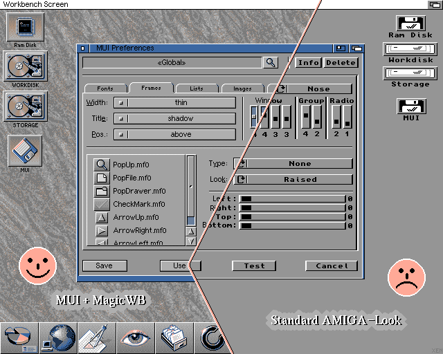
robinsonb5
4 days ago
I never particularly liked the standard hard disk icons from MagicWB, but in general I really liked the aesthetic, especially the drawers with topic icons overlaid.
As for MUI, it was a fantastic system for programming user interfaces and for displaying user interfaces, and it's one of the great tragedies of computing that nothing of that calibre exists today as a cross-platform user-skinnable UI toolkit.
It was however, very slightly lacking (on the Amiga) as a system for using user interfaces because it lacked that sense of immediacy for which the Amiga's UI was previously known.
With traditional Intuition gadgets the rendering was done within a high-priority system task, so if you click on a gadget you'll get immediate visual feedback even if the application isn't ready to respond. With MUI the drawing, and thus feedback, doesn't happen until the application's paying attention. Because of that, MUI applications felt non-native. (Even Windows-like!)
That might not seem important in today's world where that level of responsiveness was burned on the altar of network backends and web presentation layers, but that sense of "having the computer's full attention" is a big part of why the Amiga still has fans today.
abanana
4 days ago
Hear hear. This was why I could never quite understand why there was so much love for MUI in some of the monthly Amiga magazines at the time (although I agree it looked pretty). Even on my beefed-up hardware, that general lethargic feel to the UI was noticeable. Later, ReAct came along, was even worse, and I just didn't get it.
krige
4 days ago
I mean, "back in the day", I used to set my own custom WB disk to boot in 8 colors on an ECS system, which caused extra lag on many things (visible redraws ahoy), and it was more or less acceptable. Paradoxically, if I actually had one of the beefier systems, this extra lag would probably bother me a lot more than it did.
leokennis
4 days ago
It definitely has the Vaporwave aesthetic. Would love to try and test this for usability.
inigyou
4 days ago
I think the desktop is too cluttered. Icons don't stand out from the background. Window UI looks fine though.